Iron Deficiency
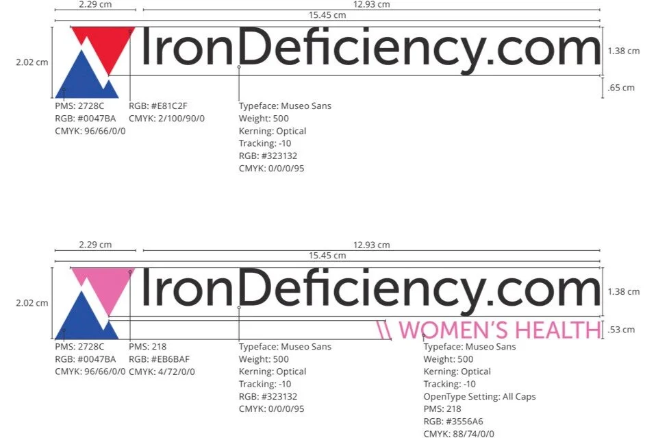
IronDeficiency.com is an informational website on iron deficiency for a major Swiss pharmaceutical company.
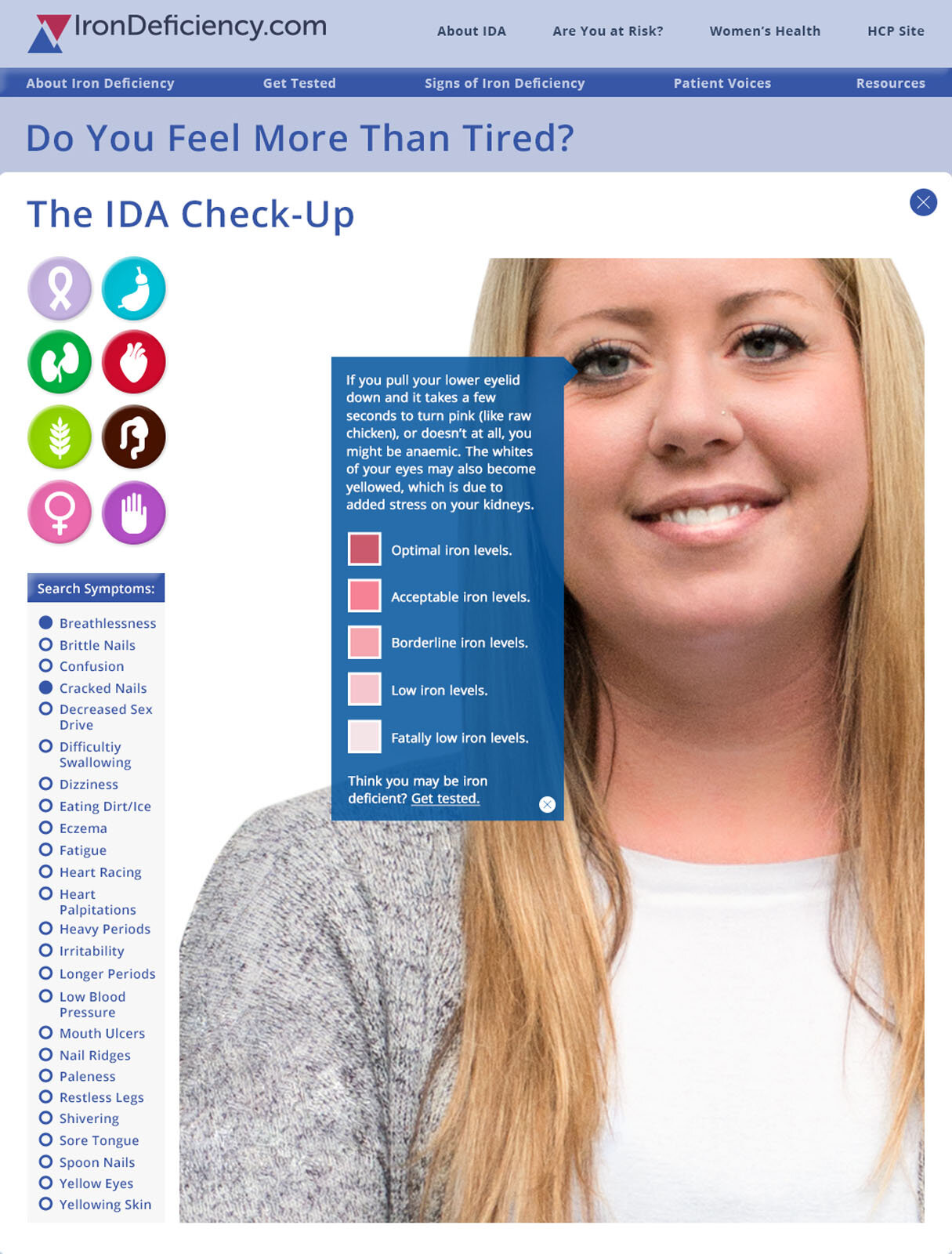
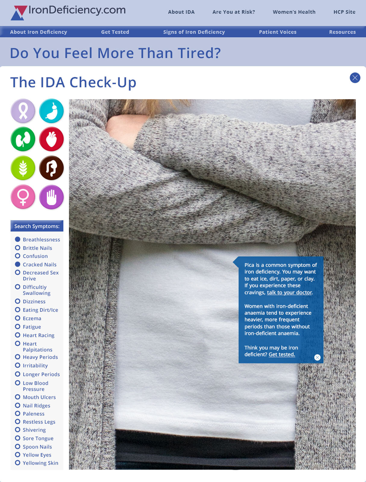
Below shows the process and outcomes for creating the branding & interactive checkup tool for patients to explore the symptoms of iron deficiency that was completed at ICON Worldwide.
Branding
Mind maps, naming brainstorms, train ride doodles, & spec sheets for an international brand.
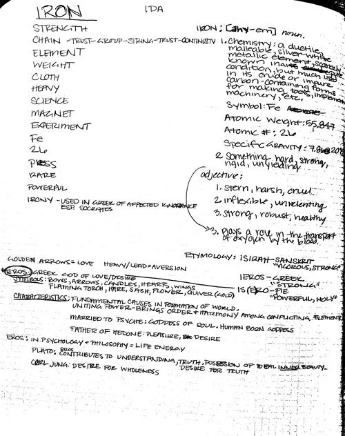
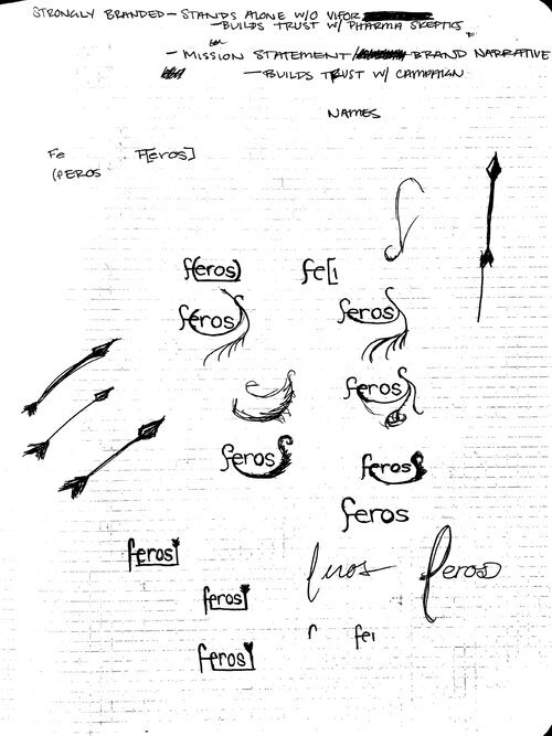
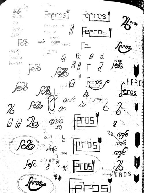
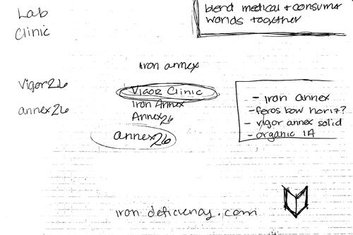
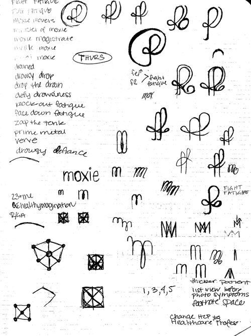
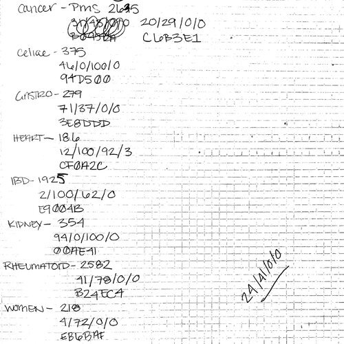
Sketches & notes documenting the process of understanding iron deficiency symptoms, patient needs, & medical professional need from the website.
The IronDeficiency.com symbol is designed to reflect the visual impact of iron on your blood. As iron levels decrease – as indicated by the red arrow – the less red blood becomes, which is symbolized by the blue arrow.
The white space formed where the arrows overlap creates the backslashes that indicate the condition-specific subsites of IronDeficiency.com, while also reflecting the intersection of the patient and healthcare professional content.
The typeface Museo Sans reflects the geometric nature of the symbol, while the bold weight balances out the icon when it appears without the condition-specific subsite typography.
Interactive Check-Up Tool
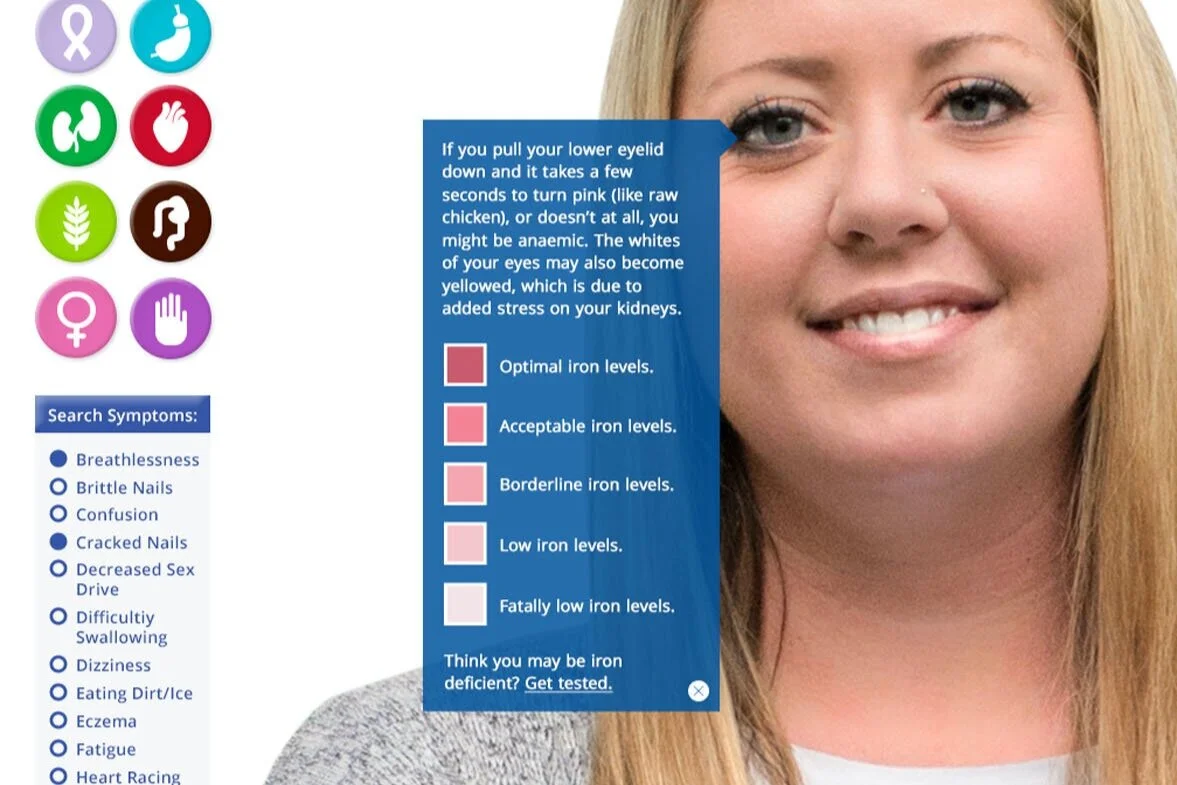
The interactive check-up tool utilizes CSS3 & HTML5 to engage users with the symptoms of iron deficiency.*
*Please don’t digitally diagnose yourself though.
Credits: Danielle Beattie for the final website design & modeling.
